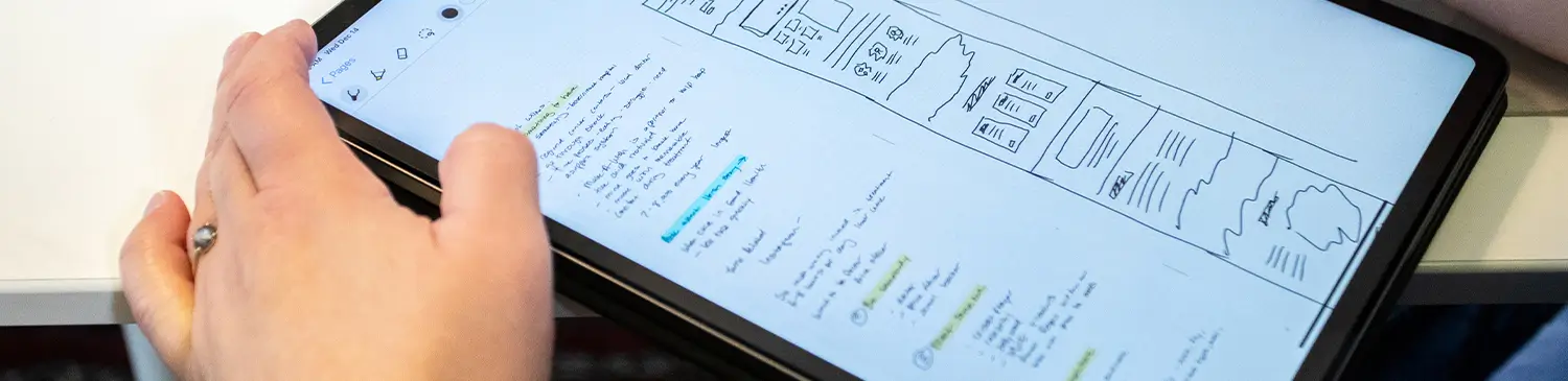

TL:DR: A responsive Dallas web design starts with mobile-first layout and works outward—flexible design, clear navigation, readable typography, tappable CTAs, and scannable content all need to work together across every screen size.
A well-designed Dallas website should perform equally well on smartphones, tablets, and desktops, using a mobile-first approach that prioritises how people browse today. With more people browsing on phones and tablets than desktop computers, website design Dallas should prioritize a seamless mobile experience from the start. Here are five practices to consider.
1. Flexible Layout
A mobile-friendly design should be the goal from the beginning of the web design process. Every aspect of your design should be easy to view and read on the smallest screen available—designing only for a large screen risks a site that shrinks into an unusable mess or forces horizontal scrolling. That said, don’t ignore the desktop either; the goal is a design that’s amazing on every screen.
2. Navigation
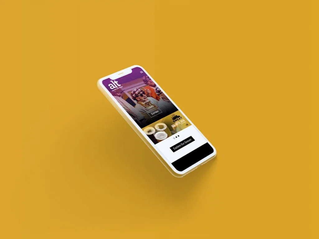
Navigation can be tricky when it comes to Dallas web design. The full desktop navigation menu simply doesn’t work on a phone screen, which is why the familiar hamburger icon has become the standard workaround for surfacing navigation on smaller devices.
3. Typography and Images
Your typography and images carry your message, so both need mobile-specific attention. Choose a font that’s large and clear enough to read quickly—but not so large that it creates awkward line breaks on mobile. Pair that with appropriately sized images; there’s no reason to load a 4,000px image into a 500px space, and doing so only slows down load time.
4. Calls to Action
Calls to action are important features in website design Dallas. Buttons need to be large enough for people to tap when they are on the phone. In addition to creating larger buttons, make sure that visitors can easily find your calls to action items. Whether they are at the top of the page or near headings, each call to action should be prominently displayed.
5. Content
People online prefer easily scannable content. Headings and subheadings accomplish this, breaking even content-heavy pages into simple, bite-sized pieces that are easy to navigate.
Frequently Asked Questions
What is responsive web design?
Responsive web design means a website automatically adjusts its layout, images, and navigation to look and function well on any screen size, from a phone to a desktop monitor.
How do I know if my website is mobile-friendly?
Try navigating your own site on a phone. If you’re pinching to zoom, struggling to tap buttons, or scrolling horizontally, your site likely isn’t fully responsive.
Does responsive design affect my SEO?
A mobile-friendly website is important for both rankings and usability, as search engines reward responsive designs and visitors expect a seamless experience.
How long does it take to build a responsive website?
Timelines vary based on the scope of the project, but a thoughtful web design process that accounts for every screen size from the start typically takes several weeks.
Can an existing website be made responsive, or do I need a rebuild?
It depends on how the original site was built. Some sites can be retrofitted, while others—especially older ones—perform better with a fresh build designed around responsiveness from day one.
Key Takeaways
- Mobile-first design should guide the process from the start, not be retrofitted afterward.
- Navigation, typography, and image sizing all need dedicated mobile treatment.
- Calls to action need to be large, tappable, and easy to find on any screen size.
- Scannable content—headings, subheadings, and short sections—matters more than ever on mobile.
- A thoughtful web design process balances every screen size, not just the largest one.
Ready for a Responsive Website?
These are just a few practices to consider when creating a responsive web design in Dallas. If you have any questions about our design process, please feel free to contact us. myheartcreative would be happy to meet with you.