
TL;DR: A “less is more” approach to web design doesn’t mean sacrificing substance—it means refining what’s there so it communicates more clearly. That applies across your content (shorter, well-written text over long blocks), typography (a few consistent fonts rather than many), navigation (only the most important pages, kept clean and simple), and plugins (only the ones your site truly needs). Done well, this makes your brand’s personality easier to notice, not harder.
When creating a new website, the possibilities for the design are nearly endless. Everything you incorporate can make it more unique and help you create the perfect experience for your audience. However, to make the best website design in Oklahoma City for your brand, you need to know when to start simplifying.
Why “Simplicity” Is Key to a Successful WordPress Website OKC
Your website should showcase the important aspects of your brand. This helps your audience get to know you and may encourage them to choose your products instead of a competitor’s. Because your boutique web design is meant to tell people everything they need to know about your brand, you may worry that a “less is more” approach could hold you back.
With the right website team, this is not a concern. Good designers know how to simplify websites without making them plain or boring. Instead, they refine the design to help users understand the content, navigate the pages, and get to know your brand. By incorporating branding elements, these experts ensure your brand’s unique attributes still shine through.
Less Is More for Your Boutique Web Design’s:
Content
Because your website’s written content needs to share information about your business and products, it can be easy to go overboard with the text. Remember, even if you write something and someone looks at it, there is no guarantee that they will read it.
People tend to skim through or glaze over huge blocks of information. To avoid this, refine your text—do not use 20 words when you can get the point across in 5. As long as your shorter content is well-written, it will be engaging and showcase your unique brand.
Typography
You also need to consider the appearance of your content. Typography involves the style, sizing, and spacing of the fonts in your WordPress website OKC. If you use too many font styles and sizes throughout your website, the design can feel inconsistent and unprofessional.
Refining your typography style can have a powerful visual effect. Begin by choosing a few readable fonts that fit your brand. From there, you can consistently use different text sizes and colors for headings and subheadings. Organizing your text this way ensures that visitors notice the key content first.
Navigation
Your website’s visitors must be able to easily find information and move between content. While including more and more pages in your navigation menu can sound like a good way to help, it will quickly become overcrowded. Instead, focus on clean and simple navigation.
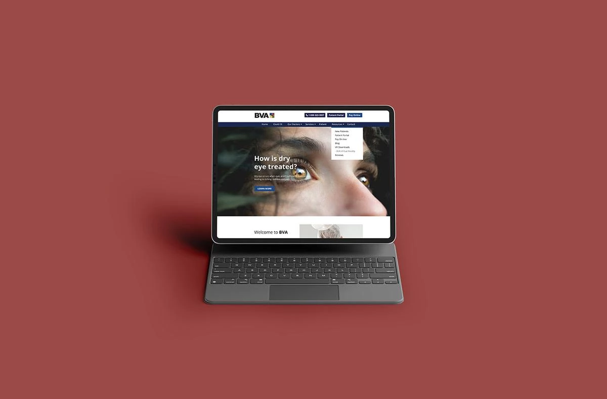
Your navigation menu should only feature the most important, frequently used pages. Once those are added, you can use dropdown arrows to direct users to subpages. To further improve navigation, incorporate call-to-action buttons and links to relevant pages throughout your website’s content.
Plugins
Integrating plugins into your website can increase its functionality; unfortunately, these useful tools can have a downside. If you add too many, you can slow down your website. Additionally, some plugins may cause functionality issues in others.
To benefit from these tools without decreasing usability, limit the number of plugins on your website design in Oklahoma City. It is difficult to put a specific number on the amount you should have, so it is best to only use the plugins that you actually need for your website to function at its best.
FAQs
Does simplifying my website mean I have to cut important information?
No. The goal isn’t to remove substance—it’s to communicate the same information more clearly, using fewer words and less visual clutter so your key messages actually get noticed.
How many fonts should my website use?
A small, consistent set is best—typically just a couple of complementary fonts used deliberately for headings versus body text. Too many styles can make a site feel disorganized and hard to navigate, rather than polished.
Will using fewer plugins affect my website’s functionality?
If you choose your plugins carefully, using fewer plugins can actually improve your website’s functionality. The goal is to keep only the plugins that genuinely support your site’s performance and features, since unnecessary ones can slow your site down or create conflicts with each other.
How simple is too simple for a website?
A website can absolutely be too pared-back if it leaves out information your visitors actually need (such as your contact details) or makes your brand feel generic. The right balance keeps your content, design, and navigation clean without sacrificing the personality that makes your brand distinct.
Key Takeaways
- Simplicity Doesn’t Mean Sacrifice: A less-is-more approach still highlights what makes your brand unique—it just removes what’s not needed.
- Content Should Be Concise: Well-written, shorter text keeps visitors engaged instead of losing them to skimming.
- Consistency Builds Professionalism: Limiting fonts, styles, and colors creates a cleaner, more polished look.
- Every Addition Should Earn Its Place: From navigation items to plugins, make sure to only include what actually serves your visitors.
Create Your Simplified Website Design in Oklahoma City
Refining your content, typography, navigation, and plugins is an excellent starting point—but it is still a starting point. The same “less is more” thinking applies to your page layouts, color palettes, and countless other details that shape your site. Because of everything that goes into creating a simple, high-quality website, it is beneficial to partner with design professionals.
myheartcreative is ready to help you create a website that reflects your brand clearly, without the clutter. Get in touch to meet with our team.