
TL;DR: A logo is just one piece of a full brand identity—a locked-down color palette, defined typography, and a documented style guide are what actually keep a brand consistent everywhere it shows up.
A finished mark from logo design OKC professionals is only one piece of a much larger identity system—a locked-down color palette, defined typography, and a documented style guide are what come next, and skipping them is how businesses end up with a beautiful logo sitting on top of an otherwise inconsistent brand.
Getting a new logo done can feel like the finish line, but it’s really closer to the starting gun. Here are four things you need next:
1. Your Color Palette Needs to Be Locked Down
A logo usually comes with two or three core colors, but a full brand needs a defined palette—primary colors, supporting neutrals, and clear rules for how they’re used together. Without that structure, every new marketing piece becomes a fresh guessing game.
Consistency Is What Makes a Palette Work
The value of a color system isn’t the colors themselves. It’s using them the same way, every time, across every touchpoint, until they become recognizable on sight.
2. Typography Deserves the Same Attention
A logo often comes with its own custom lettering, but that typeface usually isn’t meant for paragraphs of body text. As your brand grows, it’s important to establish supporting fonts that can be used consistently across marketing materials, presentations, social graphics, and other branded assets. A good logo designer near me can help guide those decisions as part of a broader branding effort, ensuring your visual identity feels cohesive beyond the logo itself. Documenting exactly how those fonts should be used helps prevent inconsistencies as new materials are created over time.
3. Following a Style Guide
A style guide takes everything decided during the logo process—colors, fonts, spacing, logo usage rules—and turns it into a reference document your whole team can use. This is what actual branding OKC work looks like once the initial design phase ends: the unglamorous documentation that keeps everything consistent months and years later.
It Protects You From Brand Drift
Without a documented guide, small inconsistencies creep in—a slightly different blue here, a stretched logo there. A style guide is what a new hire, another designer, or a print vendor references so your brand stays intact no matter who’s touching it.
4. Applying Your Logo Design OKC System Across Every Touchpoint
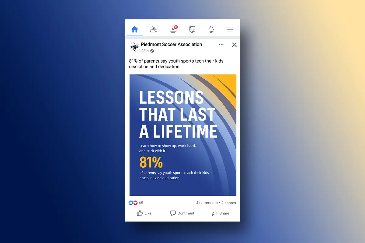
Business cards, email signatures, social profiles, signage, packaging—every one of these needs to reflect the same system the logo established. This is usually where working with a logo designer near me who understands the full identity, not just the mark itself, saves significant time and prevents mismatched materials down the line. Getting this right is really what separates a one-off logo design OKC purchase from a durable brand system that keeps paying off years after the initial design work wraps.
Digital and Print Have Different Rules
A logo that looks sharp on a website might need adjustments for embroidery, engraving, or large-format printing. Working with a designer who knows those technical variations ahead of time avoids a scramble later.
Frequently Asked Questions
Do I really need a full style guide for a small business?
Yes, even a simple one. It doesn’t need to be fifty pages—a single reference sheet covering colors, fonts, and logo rules prevents most of the inconsistency small businesses run into.
How long does it take to build out a full brand identity after the logo?
Typically a few additional weeks or months beyond the logo itself, depending on how many touchpoints need updating—business materials, digital assets, and signage all take separate production time.
What’s the biggest mistake businesses make after getting a new logo?
Treating it as finished. A logo without a supporting system tends to get applied inconsistently, which undercuts the professional impression it was meant to create.
Key Takeaways
- A logo typically comes with only a few core colors—a full brand identity needs a defined, documented color palette.
- Supporting brand fonts should be selected and documented to help maintain a consistent look across marketing materials and branded assets.
- A style guide turns these decisions into a reference document that protects your brand from inconsistency as your team, vendors, or freelancers change.
- Every touchpoint—business cards, email signatures, signage, packaging—needs to reflect the same identity system the logo established.
- Digital and print applications of a logo often need different technical treatments, so knowing those variations ahead of time avoids scrambling later.
Finishing What Your Logo Design OKC Started
If your new logo looks great but everything around it still feels mismatched, that gap is worth closing before it costs you the polish you just paid for. That’s the difference between hiring logo design OKC talent for a single mark and building a full identity system around it.
At myheartcreative, we can help you build the full system around your mark—color palette, supporting typography, brand guidelines, and consistent applications across the materials your business uses every day. As a branding OKC studio, we think beyond the logo file itself.
If you’re ready to finish what your logo started, start a project with us and let’s build a brand that holds together everywhere it shows up!