

TL;DR: Online readers scan rather than read line-by-line. To keep your audience engaged, combine mobile-responsive development with scannable elements like subheadings, bullet lists, strategic white space, readable typography, and targeted visual graphics. Pairing strong copywriting with intentional design ensures your key message gets delivered quickly and clearly.
It is common knowledge that people do not read content in its entirety. As far back as 1997, the Nielsen Norman Group reported that 79 percent of people scanned through online content. Today, that trend is even stronger as readers seek quick, digestible answers. Fortunately, there are ways to implement thoughtful visual design to grab attention and ensure that the audience receives your message.
Design Tips
Be Responsive
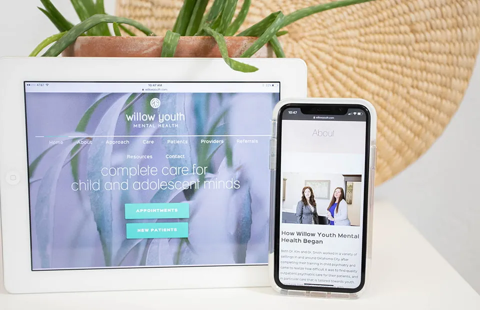
According to Fortune, 85% of people read their news on mobile devices. With a responsive design, you ensure that your content will adapt to smartphones, tablets, and desktop screens seamlessly. Additionally, Google uses Mobile-First Indexing, meaning that Google predominantly uses the mobile version of your content for indexing and ranking. Whether you have an e-commerce storefront or blog, your design must be mobile-friendly to be successful online.
Make Your Content Scannable
Most people quickly lose interest in reading large blocks of text online. On average, your audience will only read 20% of your content, as Fortune explains. You can draw your reader’s attention to your most critical points by implementing clear headings, subheadings, bulleted or numbered lists, bold font, and generous white space.
Leverage Your Brand
Your content must reflect your brand. Use your established color palette and design style to your advantage in all your communication. Consistency is critical; it will build trust and make your work stand out from the competition, according to Entrepreneur. When someone sees your content on any platform, they should immediately know who created it.
Be Visually Interesting
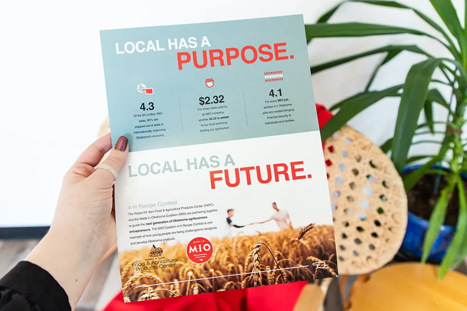
Never underestimate how a carefully placed picture or graphic will influence your audience. For example, an infographic summarizing vital statistics will connect with your reader, even if they only skim the text. Custom graphic design breaks up heavy text blocks and reinforces your primary message instantly.
Implementing Design
Creating an effective design for content is easier said than done. Even if you already have a responsive design, there is so much more to consider. Engaging content design must be clean, easy to read, and strategic.
White Space
A scannable page must have adequate whitespace (margins, padding, and line spacing) to show transitions between ideas, but balance is crucial to success. Too much space will make the page feel long and tedious to scroll. Too little space creates a cramped layout where readers will have difficulty skimming the content.
Font and Scanning
Headings, subheadings, and bold font are fantastic tools to spotlight information. When they are overused, however, the audience is unsure where to focus their attention. Additionally, make sure that the font you choose is easy to read across all screen sizes. A cursive font might look appealing, but it is harder to scan.
Color
Ideally, you will have a defined color palette for your logo and brand to guide you through all design work. When implementing color into your content design, remember to do so carefully. Color can make headings and subheadings stand out, but using too many competing shades begins to look chaotic.
Images
Graphics and photos are useful in content, but too many become clutter. Additionally, avoid using poor quality or overly generic stock pictures in your work. A stretched, pixelated photo diminishes your visual credibility. Only use images that excitingly illustrate your message and add value to the text.
Frequently Asked Questions
Why is design so important for written website content?
Design dictates how visitors process information. A clean visual structure guides the reader’s eyes to key takeaways, improves readability, and keeps users on your page longer, reducing bounce rates.
How do I know if my website design is mobile-responsive?
You can test your site by viewing it on various mobile devices or resizing your browser window on a desktop. A responsive site will automatically rearrange layout elements, scale images, and adjust font sizes to fit the screen without requiring horizontal scrolling.
What is the ideal balance between text and visuals in a blog post?
Visuals should be added whenever they clarify a point, break up long walls of text, or highlight key data. Aim to include a relevant image, graphic, or visual callout every 300 to 500 words to maintain high reader engagement.
Key Takeaways
- Mobile-First Design is Essential: Over 85% of users read content on mobile devices, making responsive layouts non-negotiable for user experience and search rankings.
- Scannability Drives Engagement: Headers, bullet points, bold text, and strategic white space help readers digest key points quickly.
- Visual Hierarchy Matters: Overusing colors, bold fonts, or cluttered images overwhelms readers and negatively impacts your content’s structure.
- Brand Consistency Builds Trust: Aligning colors, typography, and imagery across all content strengthens brand recognition.
Partner With Our Design and Content Experts
Design will improve content readability and engagement. You must never, however, overlook the importance of your words. A beautiful design will not compensate for poorly planned or thinly thought-out content. For the best results, beautifully crafted content must merge with the design. When done correctly, people will understand and respond to your message.
For Oklahoma web design and content strategy, contact us at myheartcreative. We are always ready to help you tell your story beautifully and effectively.